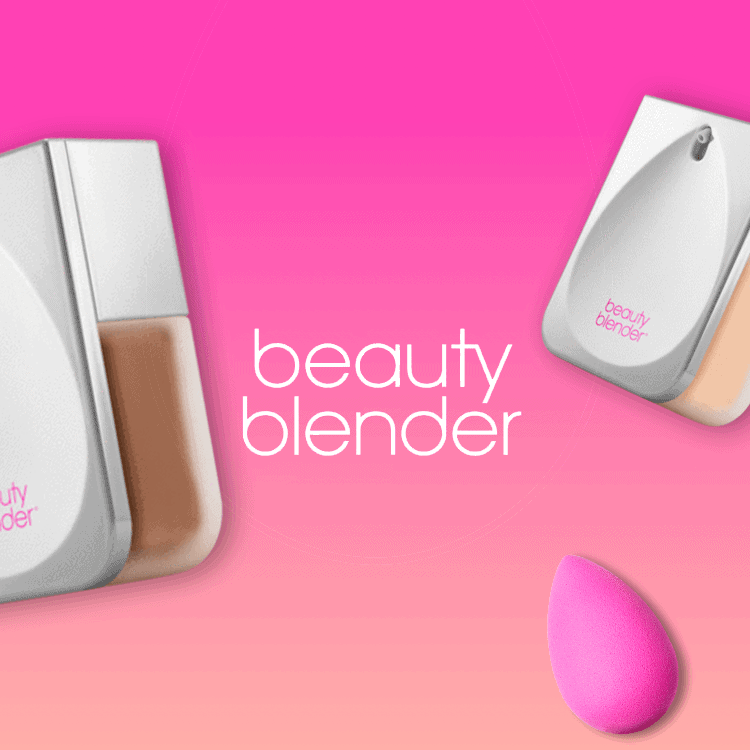
beautyblender. Shade Finder.
Beautyblender needed an online shade finder to remain competitive and push their line of foundations.
approach
Foundation should feel light and breathable. I thought the shade finder interface should feel that way too—especially since it may be an early touchpoint,

Execution
Beautyblender’s shade finder had to be more attractive and intuitive than just a series of drop-down menus like many competing sites use. The result is a short, mobile-responsive quiz where users are presented with three simple questions to determine their undertones, then narrowed down to their shade match. On the results page, users have the option to purchase their shade directly from the quiz.
